A Travel &
Ticket Management App
Year
2025
TEAM
Solo Product Designer
DURATION
March - June
MY ROLE
UX Research, UI/UX Design, Prototyping,
Visual Design, Interaction Design
TOOL
Figma, Miro, Google Forms
Pocket is a digital ticket hub built for moments of urgency.
It addresses the anxiety of finding the right ticket at the right time—especially in offline, crowded, or high-stress environments—by prioritizing speed, clarity, and shared access.
PROJECT
KICKOFF
Designing a fast, reliable ticket experience for high-pressure and offline moments.
01 OVERVIEW
THE
PROBLEM
In environments like music festivals, concerts, and airports, users often struggle to retrieve their digital tickets.
Between poor reception, disorganized inboxes, and switching between apps, what should be a simple scan becomes a stressful moment.
While people want to go fully digital, many still screenshot or print passes as a backup — revealing a lack of trust in the current mobile ticketing experience.
USER QUOTE
“I’m always worried my ticket won’t load when I need it most.
Standing in line with a bad signal makes me panic."
“I always screenshot my tickets.
I don’t trust apps to work when there’s no reception, especially at festivals or airports.”
Retrieving tickets is most stressful when users are already under time pressure — such as waiting in line, rushing through security, or navigating crowded venues.
Bad reception at festivals, stadiums, and airports often stops tickets from loading, turning a simple scan into a failure point.
Many users take screenshots or print tickets ahead of time, not out of preference but as a precaution against app failure.
Searching through email, wallet apps, or event platforms introduces unnecessary steps when users need quick access and clear information.
02 Research
INITIAL
RESEARCH
Accessing tickets should be easy, not stressful. Even though digital tickets are convenient, many users still struggle at crucial moments. This project examines real-world issues, such as a lack of centralized access, poor offline functionality, and last-minute entry stress.
To shape Pocket’s strategy, I analyzed Apple Wallet, Ticketmaster, and Eventbrite; focusing on how they handle ticket storage, retrieval, and usability in time-sensitive moments. While each had strengths, limitations like inconsistent import methods and lack of centralized access revealed key gaps. These insights informed Pocket’s design to offer a more unified and intuitive ticket experience.
DESIGN OPPORTUNITIES
Pocket addresses the stress of retrieving digital tickets by reducing uncertainty at critical moments. Instead of adding more features, the solution emphasizes speed, reliability, and clarity when users need their tickets most. The experience is designed to instantly surface the right ticket, stay dependable even without connectivity, and clearly communicate readiness before entry. By treating ticket access as a must-not-fail moment, Pocket shifts the experience from reactive searching to confident, one-tap retrieval — enabling users to pass through entry points without hesitation or backup actions like screenshots or printed passes.
03 Features
IDEATION
& CONCEPTS
FEATURE 01
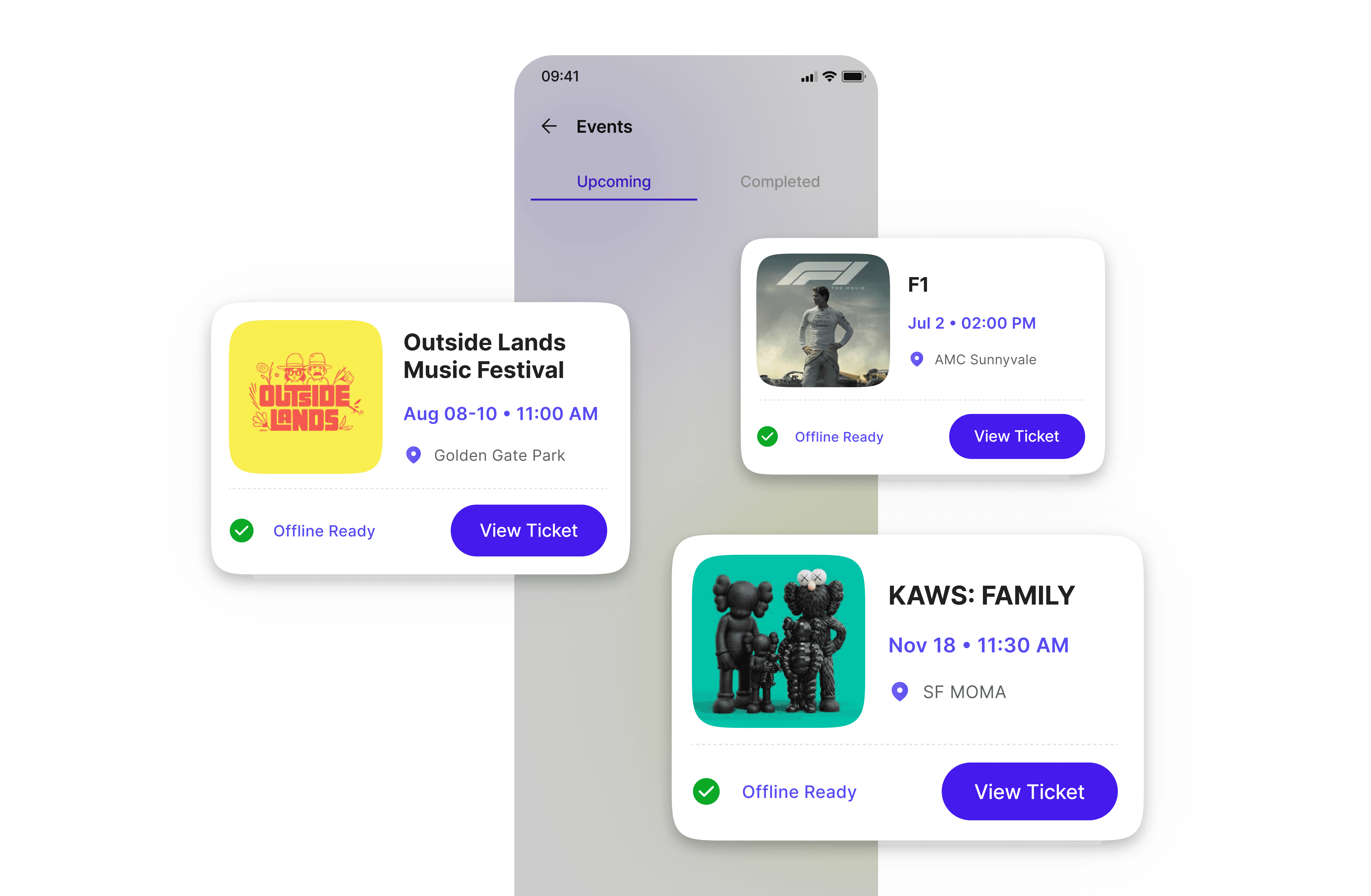
Problem
In time-critical moments, users struggle to identify the correct ticket quickly and often feel uncertain about whether it is actually ready to use.
solution
Pocket prioritizes the most relevant upcoming ticket and communicates its readiness status immediately, allowing users to confirm access and take action at a glance.
KEY decisions
FEATURE 02

Problem
At entry points, users need immediate access to scannable tickets with minimal interaction.
solution
Pocket presents ticket details as a focused, scan-ready view optimized for speed and clarity.
KEY decisions
Prioritize barcode / QR over secondary information
Reduce visual noise in critical moments
Clearly communicate status such as Offline Ready
FEATURE 03

Problem
After events end, tickets are often discarded despite still holding value as records.
solution
Pocket preserves completed trips and events as structured records for review and verification.
KEY decisions
Shift completed items from action-oriented to informational
Maintain access to past details without emphasizing scanning
Cleary differentiate completed states from upcoming ones
FEATURE 04
Problem
Users need confidence that their tickets will remain accessible, even offline.
solution
Pocket treats upcoming tickets as stored access passes that remain ready for use when needed.
KEY decisions
Stored tickets independently from connectivity
Communicate readiness through system states, not reminders
04 Iteration


Reflection
Working on Pocket clarified how critical prioritization is in time-sensitive experiences. When users are under pressure, reducing choice and surfacing a single, reliable path forward matters more than offering multiple features.
I learned that readiness works best as a system state rather than a passive indicator. Clearly signaling when a ticket is ready, needs attention, or requires action helped remove uncertainty and build trust before users reached entry points.
This project also reinforced the value of restraint. By intentionally de-prioritizing secondary content and navigation, the interface became calmer and more predictable in high-stress moments.
Overall, Pocket strengthened my approach to designing for real-world conditions—where urgency, reliability, and user confidence should drive interface decisions.